Siter
Today we will be making a recommendation of Siter.io’s standout features, a platform designed to revolutionize the way designers create websites. Siter.io is a no-code website builder that combines intuitive design tools with powerful web development capabilities, making it an ideal solution for both beginners and experienced designers. Its user-friendly interface allows you to craft stunning, fully functional websites without writing a single line of code.
Siter.io’s top features, including the Intuitive Freehand Editor, Figma Integration, and Responsive Design Capabilities. Each of these tools empowers designers to work efficiently, maintain creative control, and deliver websites that are visually appealing and optimized for any device. Whether you’re designing a personal portfolio, a landing page, or a full-scale business website, Siter.io simplifies the process from start to finish.
Siter.io’s all-in-one approach ensures that you can focus on your design vision while the platform handles the technical details. By the end of this article, you’ll understand why Siter.io is a game-changer for anyone looking to create professional-quality websites with ease and efficiency.
See below some of the best features you will have by using Siter.io:
Intuitive Freehand Editor: Simplifying Website Creation with Siter.io

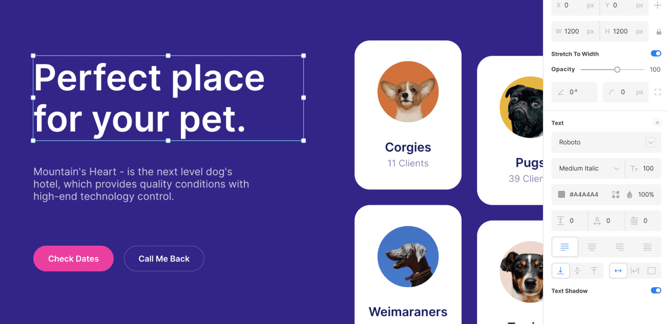
Siter.io’s Intuitive Freehand Editor is a game-changer for designers looking to build websites without the need for coding. With its familiar drag-and-drop interface and design shortcuts, users can easily create layouts and elements in a freehand environment. The editor mirrors the tools and functionality designers are accustomed to, making the transition from traditional design software to web development seamless.
This editor allows for complete creative freedom, enabling users to design directly on the canvas as if sketching on paper. Users can easily place and resize elements, apply custom styles, and experiment with layouts in real-time. The simplicity of the Freehand Editor makes it accessible for beginners, while its robust functionality caters to the needs of experienced UI/UX designers.
In addition to its user-friendly design, the Freehand Editor supports dynamic elements like animations, video embedding, and integrations with external resources like Unsplash for high-quality images. This versatility ensures that users can build visually appealing and interactive websites quickly. Siter.io’s editor empowers designers to turn their visions into fully functional websites with minimal effort.
Figma Integration: Seamless Design-to-Web Workflow with Siter.io
Siter.io’s Figma Integration allows designers to effortlessly transition from design to development, streamlining the website creation process. With this feature, users can import their Figma designs directly into Siter.io, preserving layouts, elements, and styles. This eliminates the need to rebuild designs from scratch, saving valuable time and ensuring design consistency across platforms.
The integration supports the import of complex Figma projects, including text, images, buttons, and other interactive elements. Once imported, these elements can be further customized within Siter.io’s intuitive editor, giving designers the flexibility to refine their projects and add interactive features such as animations or video embeds. This seamless workflow empowers users to maintain creative control while leveraging the best of both design and web development tools.
Siter.io’s Figma Integration is especially valuable for collaborative teams. Designers can focus on crafting detailed prototypes in Figma, while developers or project managers easily turn those designs into live websites. This reduces communication gaps and accelerates project timelines, making Siter.io an essential tool for teams looking to optimize their design-to-web workflow.
Responsive Design Capabilities: Optimizing User Experience with Siter.io

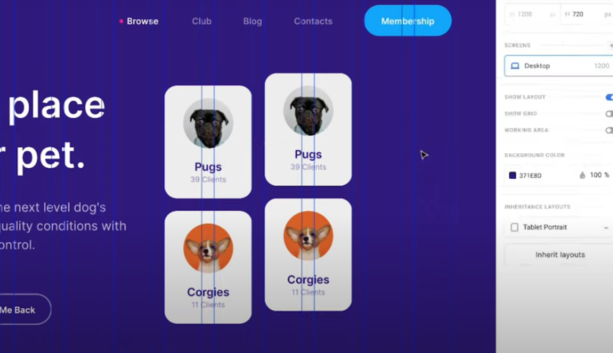
Siter.io’s Responsive Design Capabilities ensure that websites look great and function seamlessly across all devices, from desktops to tablets and smartphones. With this feature, users can create fully responsive websites that automatically adapt to different screen sizes, enhancing the user experience. By simply switching between device views in the editor, designers can preview and adjust layouts to ensure consistency and usability across various platforms.
The responsive design tools allow for precise control over each element, enabling designers to customize styles and behaviors for specific devices. Users can adjust font sizes, margins, and image placements independently for desktop, tablet, and mobile views, ensuring that content is both visually appealing and functional on every screen. This flexibility allows designers to optimize the user experience without compromising their creative vision.
Siter.io’s commitment to responsive design makes it a powerful tool for modern web development. As mobile usage continues to rise, having a website that performs well on smaller screens is crucial. With Siter.io, designers can build websites that provide a seamless, engaging experience for all users, regardless of the device they use to access the site.
To subscribe to Siter.io just click the link below.


